Web Design trends do not arise out of nothing. They are created in response to the actual demands that online users are experiencing at the moment. These requirements might include anything from making online browsing more helpful, pleasant, or comfortable.
Navigation, content, visual design, and other web aspects will always be present. Every year, though, new trends that influence these aspects emerge. As a web designer or website owner, keeping up with the newest trends will allow you to make tiny modifications to keep your website updated.
Let's take a look at some of the most important web design trends for 2022. We'll look at a few trending designs that started to appear in late 2021 and are sure to set the tone in the future year, as well as a few trending designs that are on the verge of becoming famous.
Let’s get started.
Fun and Optimism:
Throughout the decade of the 2010s, cool minimalist, simply functional interfaces dominated web and app design. That seemed reasonable at the time. Earlier the majority of the population was unfamiliar with the internet. As a result, making digital services simple to comprehend, utilise, and navigate was a top focus.
As many creatives pointed out, this had the unintended consequence of dampening the early web's more fun and experimental side. Now that the majority of people are familiar with digital platforms, there may be room for some of them to make an entry.
From funky shapes, bold color, outlandish typography and even faces can make for a lot of fun. Designers are using the web design trend with fun, optimistic designs for everything from portfolio sites to e-commerce. The common thread with these designs is that they inject a little extra happiness into the world.
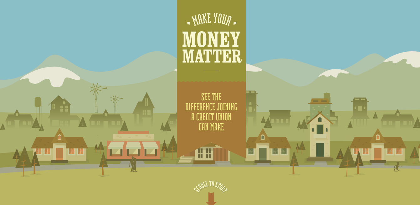
For a great example of the trend in action, check out the website from the financial industry- make your money matter. A sense of fun pervades this online experience, from the quirky cartoon character to the subtle animated elements, friendly typography and well informed data.
Muted earth tones:
Earth tones are natural-looking tints of brown, green, tan, blue, and other colours. Earth tones create a soft, subtle, organic appearance and feel in a design.
Up and down the web, we're seeing designers choose muted, calm, and earth tones in terms of background colors and illustrations to give us something restful to look at, it's a recognition of just how much we stare at screens these days.
This is a simple design that is simpler to look at and doesn't put too much strain on our eyes.
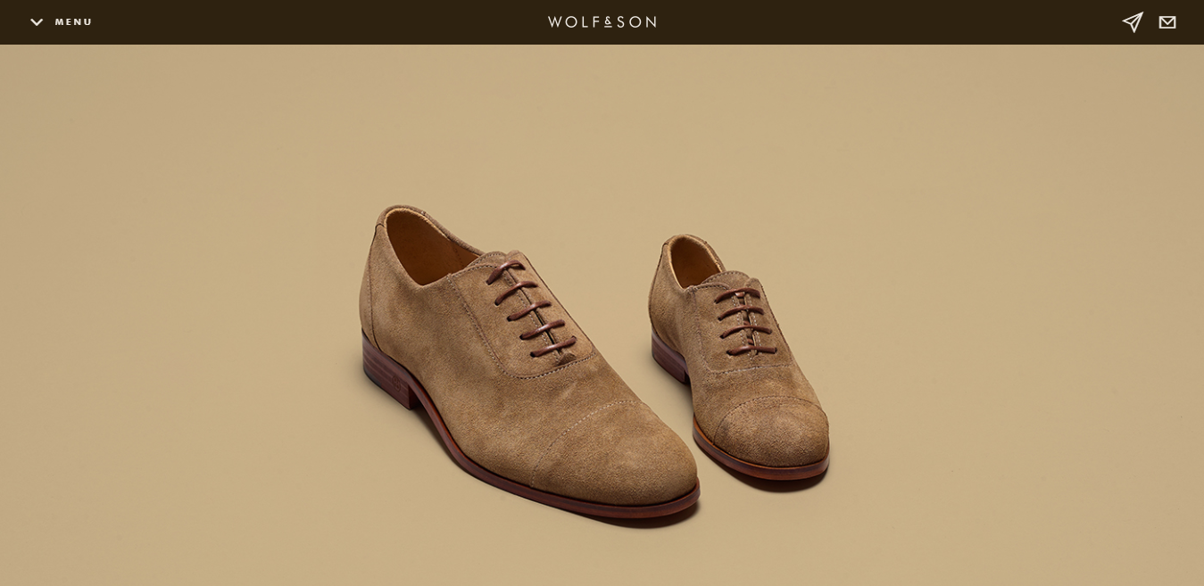
That's a philosophy that's right in the wolf and son, who sell 'men shoes'. Their website combines muted earthy colors with clear product images and a restrained layout that incorporates calming space.
ScrollyTelling:
One web design trend that's currently growing in popularity is ScrollyTelling, also known as "narrative visualisation". With this kind of design, as you scroll and read a long-form article, you get fun little visual treats, from elegantly typeset columns to quirky inset images to subtle animations and more. The simplicity of the scroll-based interaction meant that readers didn't have to second-guess what to press, click, or swipe in order to see the full story.
It's kind of like reading a printed magazine, but with the interactivity of the web and the eye-catching nature of moving images.
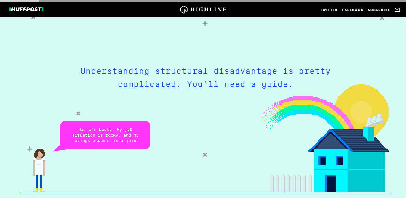
A good example can be found in this HuffingTonPost article on poor millennials. The first time you scroll through, you think you're enjoying some highly sophisticated digital trickery. But on closer examination, most of the effect here is achieved through old-school design, particularly the use of angled pull quotes to add visual interest and a sense of dynamism.
Glassmorphism:
The first hints of glassmorphism started with neomorphism in late 2020 and early 2021 and evolved into the more complete glass effect that’s popular now.
The effect is best used when there are simple shapes and backgrounds behind the blurred-out elements, such as in the two examples above. The transparency and color of the element’s background can vary, and it can easily be used and switched between dark and light mode, which is a clear advantage in today’s web design and development requirements.
Recently Microsoft also brought this design element in their Fluent design system. The translucent look and feel rightly named by Microsoft as Acrylic is nothing but an extension of this design principle called Glassmorphism.
Bold & Experimental Typography:
Big typography, which uses large, strong letters to create an effect, may make a powerful visual statement in web design, especially when coupled with a more minimalistic design or layout. Choosing a larger font size for your text may help you make a strong first impression while also linking other design components together.
When playing with this website design trend, think about how the typefaces will respond (everything looks different on a mobile screen) and how to maximize impact for visitors. Many experimental typefaces aren’t just designed with flair, they also include elements such as animations or flex options. From outlines to color fonts to shifting shapes and fills, bold and experimental type options are dominating website designs.
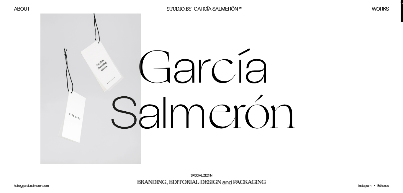
Garcia Salmeron’s homepage features a neutral, multiple bold typefaces – allowing the brand’s large logo to stand out in the center of the homepage. This, paired with vertical cut-out images.
Oversized Pointers:
This is a design trend that you’ll see in many of the examples here if you click through, but won’t see at all until you try to engage with a website design: Oversized pointers or mouse hovers.
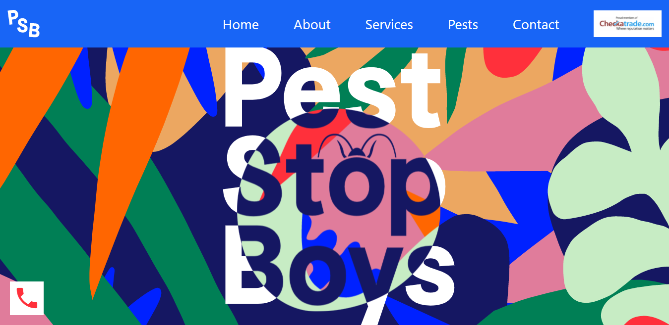
This user interface element is everywhere. The most common example and usage is the one exemplified by Pest Stop Boys with a large big pointer that moves around the screen and even changes its shape.
Brutalism:
Brutalism is the website design trend that people want to jump on board with, but it’s just too harsh and sharp to work for most projects. Enter the latest iteration of this trend – almost brutalism.
These designs use many of the same stark effects but with a lighter edge. Rather than mono typefaces, easier-on-the-eyes serifs and sans serifs are the norm. Rather than sharp edges, there’s ample space between elements even if there are some distinct boundaries and lines.
There aren’t a lot of frills or other visuals, leaving color and text to really carry these projects.
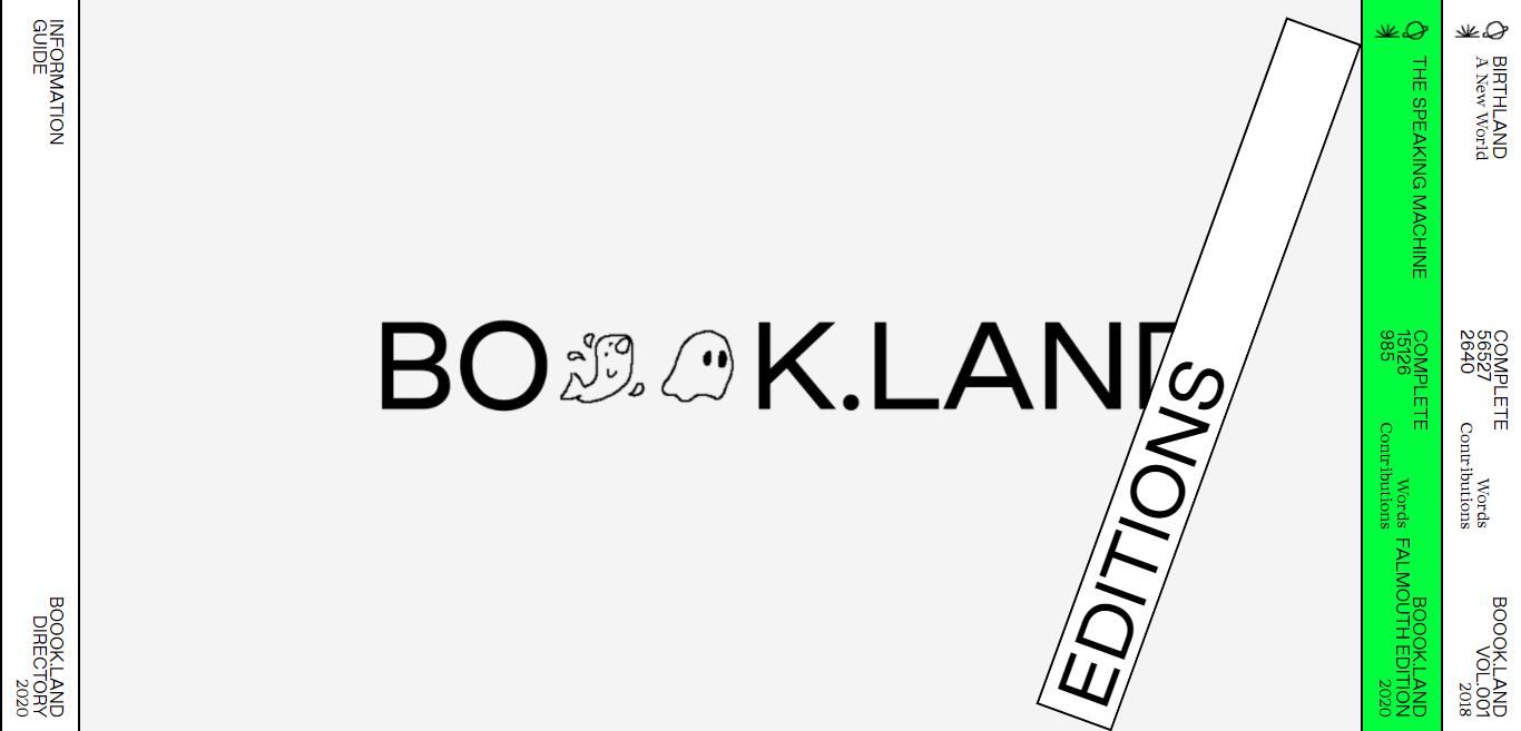
Check out Boook Land's website for a more clear understanding.
Interactive Design:
What is the best user experience we can provide in terms of design? Some may claim that it is allowing the user to select their own design. That's why, in today's world, many websites redefine interaction as more than merely scrolling up and down the page. Instead, the user may customise every aspect of the design.
They can move whole design aspects across the website, change background colors, and control when things transform by scrolling and clicking. We're seeing more of these patterns right now, and we expect them to continue in 2022.
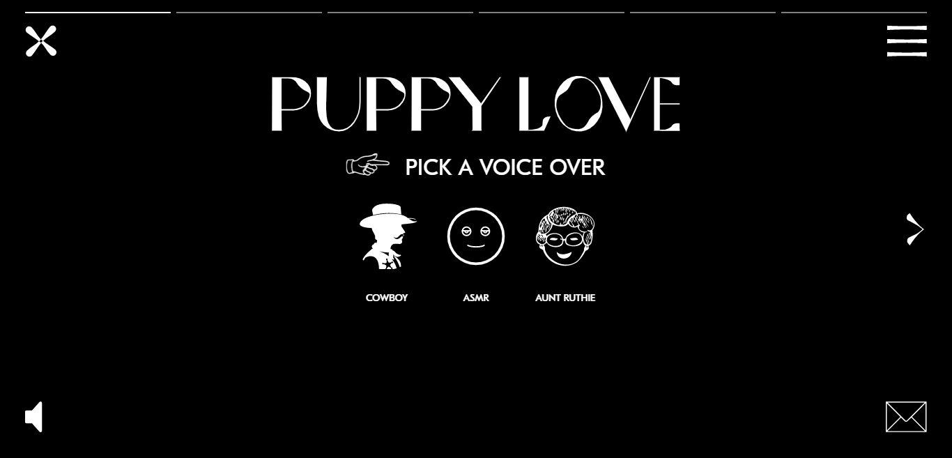
Check out the website of Puppy Love, a creative agency located in New York and Los Angeles, if you want to give it a shot. It has a sleek, cutting-edge design that's full of vigour and vivacity, as well as the option to choose your background color and voiceover: such fun.
Cinema-Style Homepage:
Many current websites include homepages that are designed in the style of a movie. These are full-screen video tales that immerse visitors in the website rapidly. It's an ideal design element for welcoming visitors to a website. It has the ability to capture attention and make people feel a part of it in a matter of seconds.
You may also personalise your cinema-style homepage. You may utilise the slow-motion effect, vignettes, and other techniques to make it more engaging. This function reduces the amount of text that must be displayed on the homepage. It's an excellent design trend to follow in 2022.
The online world today is vast and saturated with websites. To be successful, you must first stand out from the crowd. This makes good web designs not just nice to have but essential. It can be tricky to provide a fantastic user experience if you do not have a good strategy.
In this article, we've introduced you to some of the biggest web design trends affecting the industry right now, which we fully expect to extend their influence in years to come. Think about how you can merge these elements into existing projects or as a part of something new. And most of all, enjoy it!


