If you want to reach the summit of a mountain, you need to be as light as possible. You'll have the greatest space and the best perspective of the world at the top, when it's just you and your essential gear. Minimalism allows you to get the most out of your travel by using the fewest resources possible.
That's what minimalism is all about.
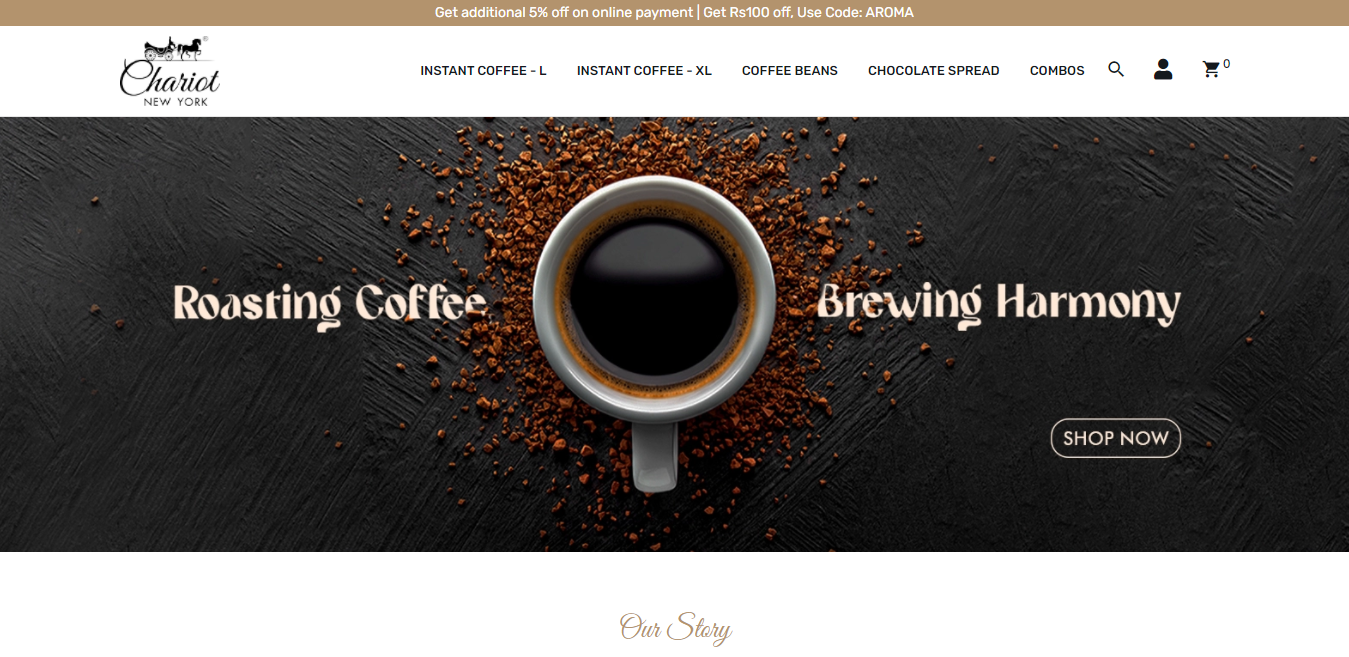
In the area of online design, minimalism is all about delivering seamless user experiences free of distracting design elements.
The end goal is usually to sell something, whether it's ideas, products, services, or information. The user experience (UX) is an important component of any digital interactions that visitors have with your business.
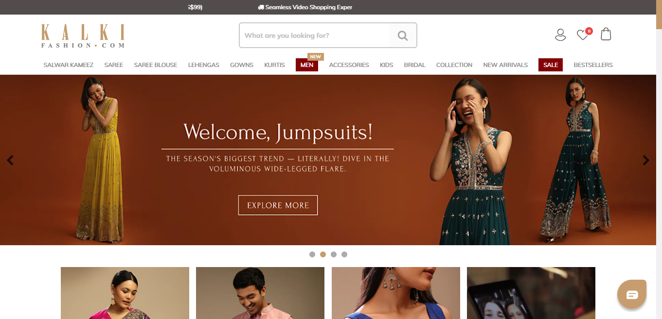
You've lost a potential client if your site is so cluttered that the viewer can't figure out what you're offering in 5 seconds. It is for this reason that companies allocate millions of dollars to user experience alone in their budgets. Using a clean, straightforward, minimalist style can instantly show your visitor what you have to offer and effectively communicate your message.
Inquiries, recalls, references, conversions, and sales will all increase on such a website.
Keep reading because we're about to give you some useful tips.
Fewer Page counts:
To create a minimalist web page, keep the number of pages to a minimum to improve the user experience and give the page a cleaner look. The user will stay on the page longer and prefer such sites if the material is minimal and the page count is low. All you have to do to give it a boost is write content from the user and limit it. The web page would receive a lot of traffic if it had more informative material and fewer pages.

Minimalize Applies to Your Images Too:
Adopting minimalism in web design necessitates applying it to all aspects of the site. That includes photos as well. You want to utilise clean, crisp images rather than overpowering, busy images that take attention away from what counts most, which is your content and the page's message.

A Three-Color Limit:
Use well-thought-out colors that complement your brand and other designs, but don't go overboard with too many. A minimal palette with effective use of an accent colour to draw attention to key places. Most minimalist guidelines recommend keeping to a three-color palette. The more colors you utilise in your site design, the more likely the user will become distracted and leave the page.
Choose two colors that relate to the brand or convey it to the audience. Play with the many hues of those two colors to give the web page a vibrant yet professional appearance.
If you want to make textures, you'll need to use various shades of the same hue.
Designers who specialise in minimalism are regularly seen.
Minimalist designers frequently squeeze the most out of a few carefully chosen colors, and it’s not uncommon for designers to utilize only one hue (a monochromatic color).
Trendy Typeface:
Understanding the significance of typefaces is a skill in and of itself. Don't be afraid to experiment with different typefaces to assist bring attention to different portions of your site or to highlight key sections.
The typography is important, but so are the size, type, weight, and unique colour. Choose a modern typeface that effectively communicates the contents. Not only does the material convey the website's concept, but it also draws the user's attention.
Always make sure that the font type you choose is consistent throughout the web page, since this helps to maintain the flow and avoids design disruptions. The type of typeface you use enhances the user's experience and keeps them engaged.
Apart from being so attention-grabbing, great typography also makes navigation and comprehension easier. Choosing the right fonts can improve readability by creating a clear hierarchy of your messaging, which helps the user enjoy their experience.
Don't Be Afraid of White Space:
Gone are the days when you had to fill every blank space on the page. You don't have to include something just because there's space! "Let's get rid of that empty space," or "There's too much white space," have you ever heard a client say? That's why you've been hired as the designer! Stick to your guns and make it clear that every design element need breathing room.
It is ineffective to use too many design components on a single page or in a single design. White space helps to separate content groups and keeps elements from becoming cluttered. It also assists viewers in navigating the design.
In fact, it can be a powerful tool in minimalist web design that can help focus user activity and drive people towards the pages you want them to visit.
It doesn't matter if you are a new business or an established name, redesigning your website to adopt a more minimalistic feel is always a smart move.
Not only is a minimalist website a great way for your users and customers to have a more enjoyable and effective experience, but also, it never truly goes out of style.
Make the move to a minimalist life today. If you don't know where to start, we've got you covered. Just get in touch and see the wonders.


