How do you capture a customer’s attention with a couple of words and push them towards a conversion? How do you create a CTA button which is irresistible to click? Is it possible to find web design templates where CTA-buttons would meet the requirements? How much thought have you really put into your CTAs? Calls To Action, or CTAs, have the heavy task of turning your visitors into prospects. Of course, there are many other factors that go into creating a high-converting page, but in this article We will focus on the CTA to get your audience onto the next stage in the path to purchase.
You can create a great CTA of any shape, style, and size. The main thing is to create CTA buttons in keeping with the style and idea of your website. Log in, Shop now, Get Your Discount, Add to Cart are some popular examples of modern call-to-action buttons.
There are lots of tips on the web that were collected to help you make the right choice of placement, shapes, colors, text, and more. We’ll do that by highlighting six characteristics of high-converting CTA buttons, along with examples from various websites to help you get a better idea of how to incorporate these characteristics into your own pages.
Let’s find it out.
What is a Call-to-Action Button?
A call-to-action button is a piece of text, sometimes combined with an image, that is the second step of your Inbound Marketing strategy, preceding the moment of purchase. For instance, you might insert a call-to-action button at the end of your blog posts. It might invite readers to check out more posts, sign up for your email list, or something else entirely. Your call-to-action button is the bridge between the content your visitor is already interested in and an offer of higher value. It’s typically the button, link, or image that you place strategically on your website to encourage visitors to become leads or customers.
Why should your website have a Call-to-Action Button?
Remember that your call-to-action button can be used in any situation where you want your user to do something. It evokes emotion in your audience. It’s not mandatory, but strongly recommended. Marketers rarely take chances with their website conversions and usually incorporate the button in the design. Recall all the websites you’ve seen lately, and you may not even remember a website without a CTA button.
Characteristics of High-Converting CTA Buttons
Target Placement:
How can you make your call-to-action buttons work for you? Fortunately or unfortunately, there isn’t any definitive placement system. It depends on your own website’s specialty and page template structure.
The basic idea here is that you need to place your CTA buttons in the direct path of your users. So as you determine where to place your buttons, keep your readers in mind. Arrange your copy and buttons in a way that encourages a natural reading flow that ultimately directs them to your CTA.
A product landing page’s primary goal is typically to generate sales. Driving engagement with content might be a secondary goal, but when it comes down to it, a purchase is what generates revenue. That’s why most sales-focused pages feature a purchase-related CTA in users’ direct line of vision.
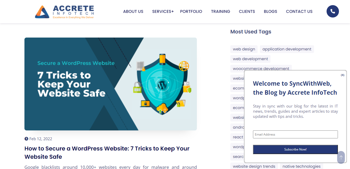
You don’t want your viewer’s attention to get distracted, but you still need him or her to take more than one action. This is when multiple call-to-actions come into play. Don’t forget that pop-ups need to have neat and clear call-to-action. By nature, a pop-up is an extra attention-driving design detail, and adding a proper call-to-action here is vital.

A good CTA needs to be visible. This means, there needs to be enough empty space around the button to suggest interactivity and position where users expect to find them (add-to-cart buttons, for example, are often located in the top right corner of the page).
Color Solutions:
Colors play an important role everywhere in our life and call-to-action buttons are no exception. There aren't any rules for which colors work best, but there are three general principles you need to apply.
First of all, make your CTAs stand out through contrast. They should be attractive and catchy for your audience. The color should highlight the button among backgrounds and content.
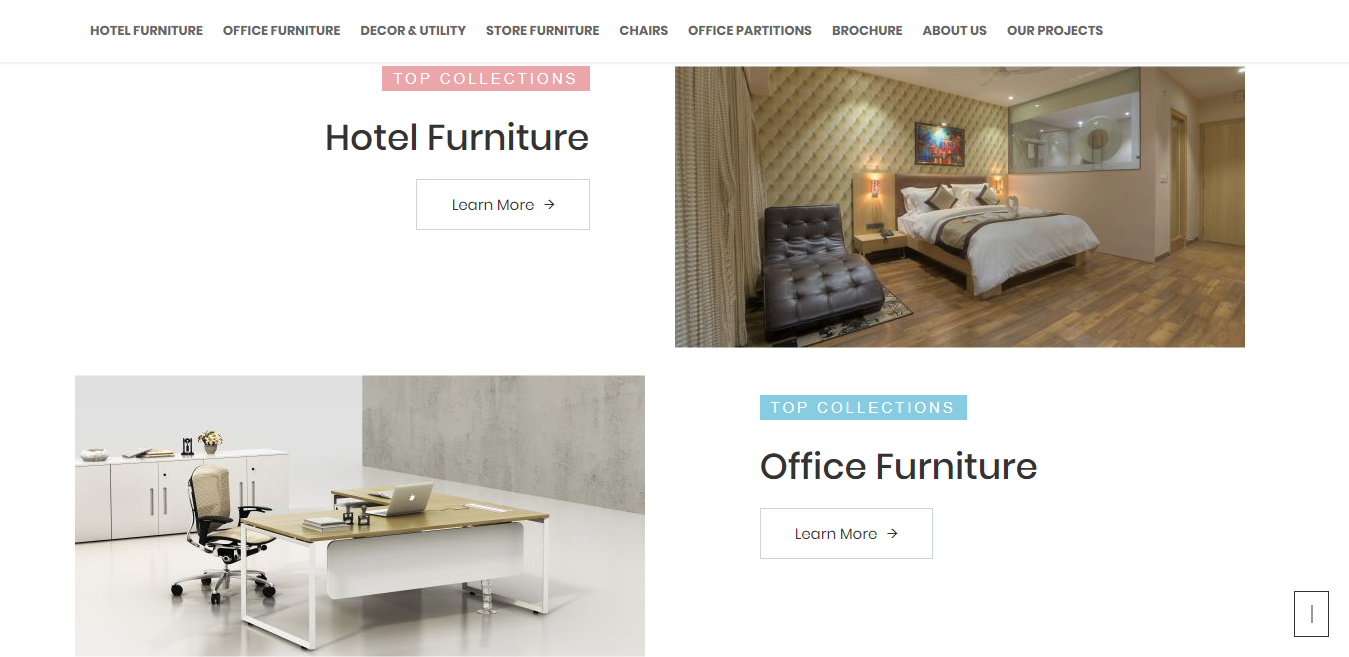
They need to fit the design so they don't spoil the overall aesthetic. This is a different balance to pull off, but the design above shows it can be done.
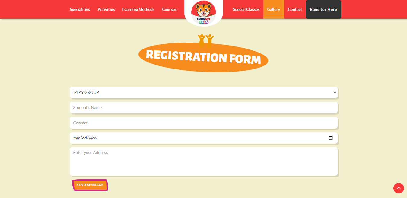
Pay attention to your audience. If you will be more attentive to people’s preferences on your website, you’ll get your target audience, so, will boost your conversion. For example, using dark colors and subtle backgrounds on a kids’s website will definitely make you a loser.

Make sure that your website’s design fits the age, gender, social status, etc., of your audience. The youth adores bright colors, so, make your CTA buttons look fruitful and catchy. Professional audiences prefer shades and low-key tones, so it's better to create your call-to-action buttons that look restrained and laconic.
Button Shape:
By nature, people tend to like softened angles. Discard all the common tropes, and make your CTA buttons look special, extraordinary, and unique. Well-shaped call-to-action buttons will definitely help you to hit the mark.
Button Text:
What do you think about the text on versatile CTA buttons? Every well-done call-to-action button should have two or three words on one line, rarely more. A CTA button should have the target word that perfectly matches what the client receives after clicking on it. For example, subscribe, shop, get, buy, win, and more. In an ideal situation, you need to use effective verbs together with a suggestion-referred text. Book a table, try a demo, and download a freebie are pretty good examples.
Every visitor should feel the benefit they will get after your call-to-action buttons. If there is no benefit for the customer they won’t click. If your audience loves improving their knowledge base, start your call-to-action buttons from “Read” or “Learn” words. It will help you to evoke the interest of such kinds of people and to keep them engaged. Another cool way of creating effective call-to-action buttons is to brighten them up with versatile elements such as shopping carts, wallets, hearts, smiles, arrows, etc.

Pay attention to your visitor's needs, their preferences, highlight reasons for buying, reading, etc., and make sure your message is clear enough to avoid surprises after clicking on them.
Use The Power Of Animation:
What we are talking about at this point is a hover effect, which can change the button’s color on the mouse-over. By changing its physical appearance, the call-to-action buttons look far more captivating. A changing color keeps the users alerted that it is ready to be used. From the physiological point of view, a blinking button plays with a user’s mind and motivates them for an action.
A call to action button is an integral part of your online marketing campaign. So, enrich your websites with well-done CTA buttons underpinned by laconic and motivational text, unusual shapes, correct placement, and captivating color. Do not be afraid of experiments because effective call-to-action buttons can also be a great figment of your imagination!
We hope that you find the aforementioned tips useful, and they will help you attain the desired conversion boost on your website.


